Overview
Pingo Doce is one of Portugal’s leading supermarket chains, with a strong marketing presence and a well-established connection to traditional Portuguese cuisine through cookbooks and recipe promotions. This focus on food culture made it a natural fit for our team’s project, where we were free to choose a brand to design for.
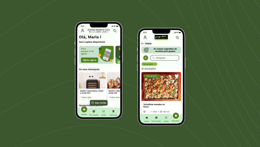
The challenge was to help reduce food waste through a new app feature. Our solution was a portion calculator, designed to help users better plan their meals by adjusting ingredient quantities based on recipe type and cooking experience.
Developed collaboratively, the project covered the full design process; from user research to prototyping; with the goal of creating a tool that is both sustainable and aligned with Pingo Doce’s brand values.
Process

Discovery
Food waste is a growing concern in Portugal, with each person throwing away about 184 kg of food annually, costing around €350 per year. This makes Portugal one of the top food-wasting countries in Europe. Beyond the financial loss, this waste contributes to CO₂ emissions and the unnecessary use of thousands of liters of water.
Given Pingo Doce’s strong connection to Portuguese cuisine and its promotion of recipes and cookbooks, this project saw an opportunity to align with their brand while addressing a real problem. The goal: design a portion calculator feature that helps users plan meals more accurately and cut down on waste.
Research
To better understand the problem, validate our chosen brand and feature, and define our target audience, a questionnaire was conducted. From 114 total responses, 106 were valid, coming from people who actively cook. Among them, 91 reported difficulties with portioning, reinforcing the relevance of our solution.
Results

9 in 10 respondents reported difficulties with portioning.

7 in 10 respondents reported difficulty when cooking for 4+ people


Although 92% of people cook at least once a week, they only search for recipes online occasionally. Supermarket websites are among the top three places users search for recipes, yet the Pingo Doce app does not currently offer this functionality.
Key Issues Identified
- Clear and Visual Measurements Users want precise, easy-to-understand measurements with practical tools like visual aids, tables, or built-in calculators to simplify quantity estimation.
- Recipe Flexibility Users want recipes that can be easily adjusted based on the number of people, with clear indications of portion sizes per person.
- Automatic Ingredient Converter Participants highlighted the need for an automatic converter to adjust ingredients while keeping the intended number of servings consistent.
- Scalable Recipes Users value recipes that are easy to scale up or down, with accurate ingredient quantities per person and real-life kitchen measurements like spoons or cups.
- Simple, Universal Units Many requested the use of everyday, intuitive measurements; like tablespoons and cups; over complex units such as grams, to make cooking more approachable.
Problem Statement
Although most participants cook regularly; 92% at least once per week; the majority experience recurring difficulties with portioning, especially when preparing meals for larger groups (4+ people). This issue affects 87% of respondents, with younger adults (18–35) and women making up the bulk of the affected audience.
Despite frequent cooking, people only search for recipes online occasionally, relying mostly on recipe websites, social media, and supermarket platforms. When they do, they encounter recipes that are hard to scale, lack intuitive measurements, or don’t clearly indicate quantities per person.
There is a clear opportunity to create a tool that supports everyday cooks with simple, flexible, and user-friendly portioning features, helping them reduce food waste and plan meals more effectively.
Persona

Maria Robalo is a 28-year-old Digital Project Manager who cares deeply about sustainability and healthy living. She thrives in social settings, loves cooking for others, and often hosts friends and family at home. Organized and curious, she’s always looking for balanced, eco-conscious choices, and often finds cooking inspiration through digital channels. She values aesthetics and believes that food should be appealing, healthy, and socially meaningful.
- Recipes that adjust easily to different serving sizes.
- Intuitive and visual measurement aids (e.g., spoons, cups, calculators).
- Clear, consistent portion guidance to reduce waste.
- A way to understand ingredient amounts at a glance.
- Confusing or inconsistent measurement units (especially grams).
- Recipes that don’t scale easily for different group sizes.
- Having to manually recalculate ingredients for more people.
- Lack of clarity around how much is “enough” per person.
- Saving time by not having to do manual conversions.
- Feeling confident in the accuracy of quantities.
- Cooking for guests or family without guessing portions.
- Using sustainable amounts and reducing food waste.
Strategy
To shape our strategy, we began by outlining the task flow for the feature. This allowed us to clarify the essential steps for a smooth user experience, ensuring we included only what was necessary while eliminating any friction or redundant actions.

Competitive analysis
To define our strategy, we analyzed various cooking and recipe platforms to understand how they tackle portioning, recipe customization, and usability. Our goal was to identify both inspiration and opportunities for innovation. Below is a visual breakdown of our key takeaways:
Key Takeaways

Clarity & Simplicity
Users prefer universal, visual measurements (e.g., cups, spoons) over grams.

Flexibility is Crucial
Many tools fall short by limiting serving adjustments or only giving proportional hints.

Recipe Adaptability
It's not enough to scale ingredients; the app must adapt recipes while maintaining clarity.

Integration Adds Value
Merging features like shopping lists, nutrition info, and portion control adds real usability.
Wireframes

Design
Finally, it was time to bring the ideas to life. Building on insights from the previous phase, the focus shifted to defining the visual direction of the final design. Key decisions were made around color palette, typography and hierarchy, iconography, and other UI elements to ensure a cohesive and accessible user experience.
UI Kit


High Fidelity Prototype
After refining the wireframes based on user feedback, the project moved into the high-fidelity wireframing phase. This stage focused on translating the improved structure and functionality into a visually accurate design, incorporating the final layout, branding elements, and interactive components to closely reflect the final user experience.